Data-Driven Transportation Display
Context: Create a display for the Atlantis Transportation Hub in the San Juan Islands Archipelago for 3 user personas
Date: October 2018 (3 weeks)
Key Concepts: User personas, Prototyping, Control Design
Tools Used: Adobe Illustrator/InDesign/AfterEffects, FramerX, Keynote
Collaborators: Clara Olson | Peng Zheng
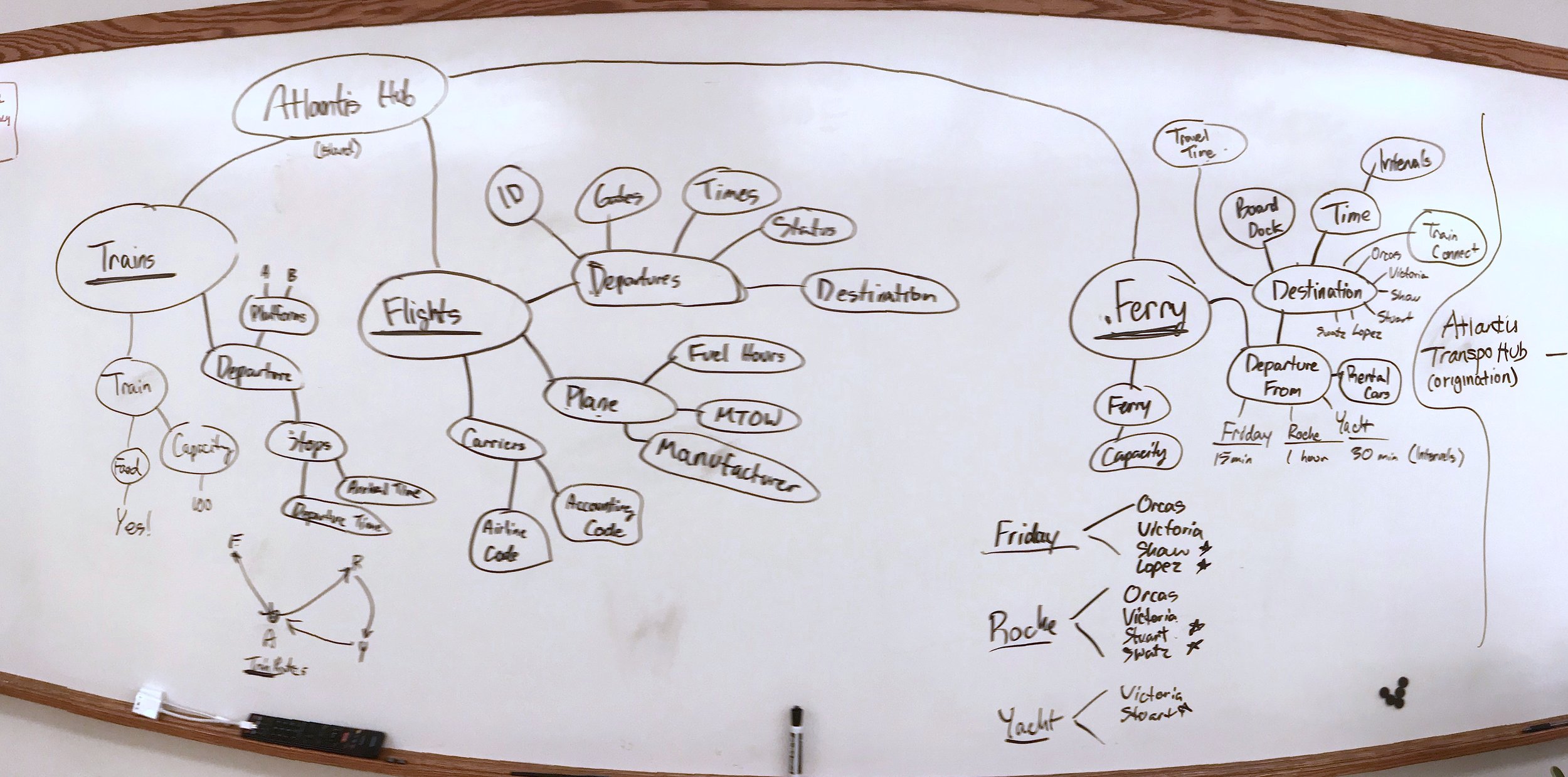
A diagram outlining every piece of information present in the dataset. This was helpful in determining what kind of information was related and later helping us decide what information was extraneous and thus, excluded in our later designs.
Background and Exploring Data
To get a better sense of how we would approach this project, our team decided to first collect some secondary research online about the San Juan Islands. Right away, we could see that the San Juan Islands, located off the coast of Washington state, was a beautiful archipelago known for its many tourist attractions including national parks, orca whales, and recreational fishing. The fictional Atlantis Transportation Hub is located on the main island and has three modes of transportation (plane, train, and ferry) as well as a new program known as the PTF Pass that we defined as a transportation pass that allows users a great amount of flexibility and
With an understanding of the geography and “feel” of the islands, we looked through the (fictional) transportation dataset for the Atlantis Transportation Hub for any patterns that could help us create an effective and attractive display design.
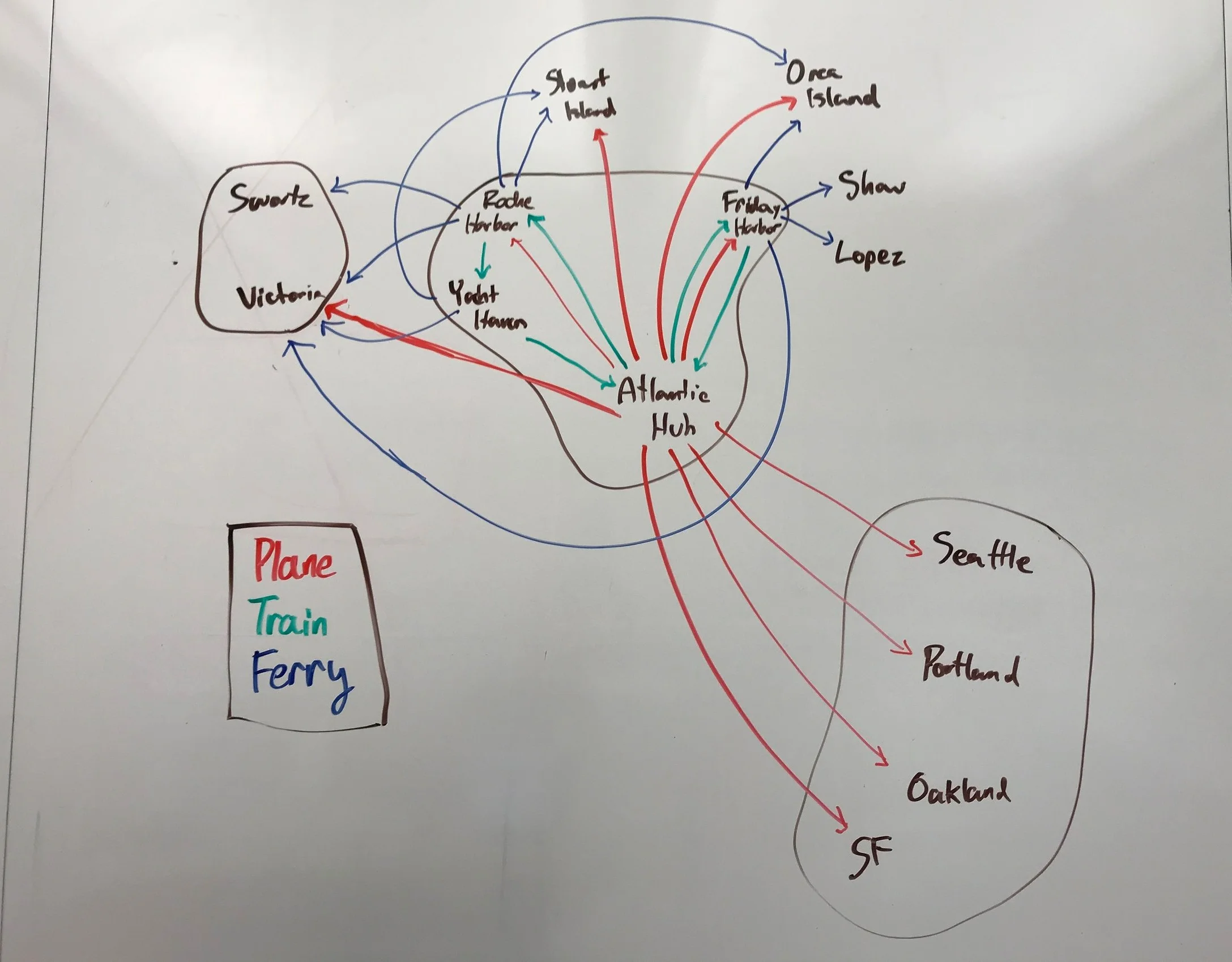
A geographical representation of every destination in the dataset. This was most helpful in visualizing what places were connected and the focus on modality (transportation by plane, train, or ferry).
For ferries and trains, the physical map diagram greatly helped visualize how trains are essential for in-land travelling, ferries are the primary mode to travel across islands, and flights are especially important for that depart to the mainland cities in the United States (Portland, Seattle, San Francisco, and Oakland) while ferries were more frequent for the two locations in Canada (Victoria and Swartz Bay).
Looking back, it was confusing at first to not have the user personas when first interacting with the data but this phase proved beneficial in our understanding of what was actually in our dataset.
Had we begun immediately with user personas, we might have missed some critical patterns, such as the regularity of the train and ferry departures or the high air traffic time in the morning, that we would not have been able to take advantage of or plan for in our final design.
Our findings from this exploration helped us with our next step: mapping data to personas.
User Personas
We were assigned three user personas, each with a different background that prompted us to assess the connection of the given data about the transportation hub to our three distinct stakeholders and how to later represent the relevant information. These user personas were:
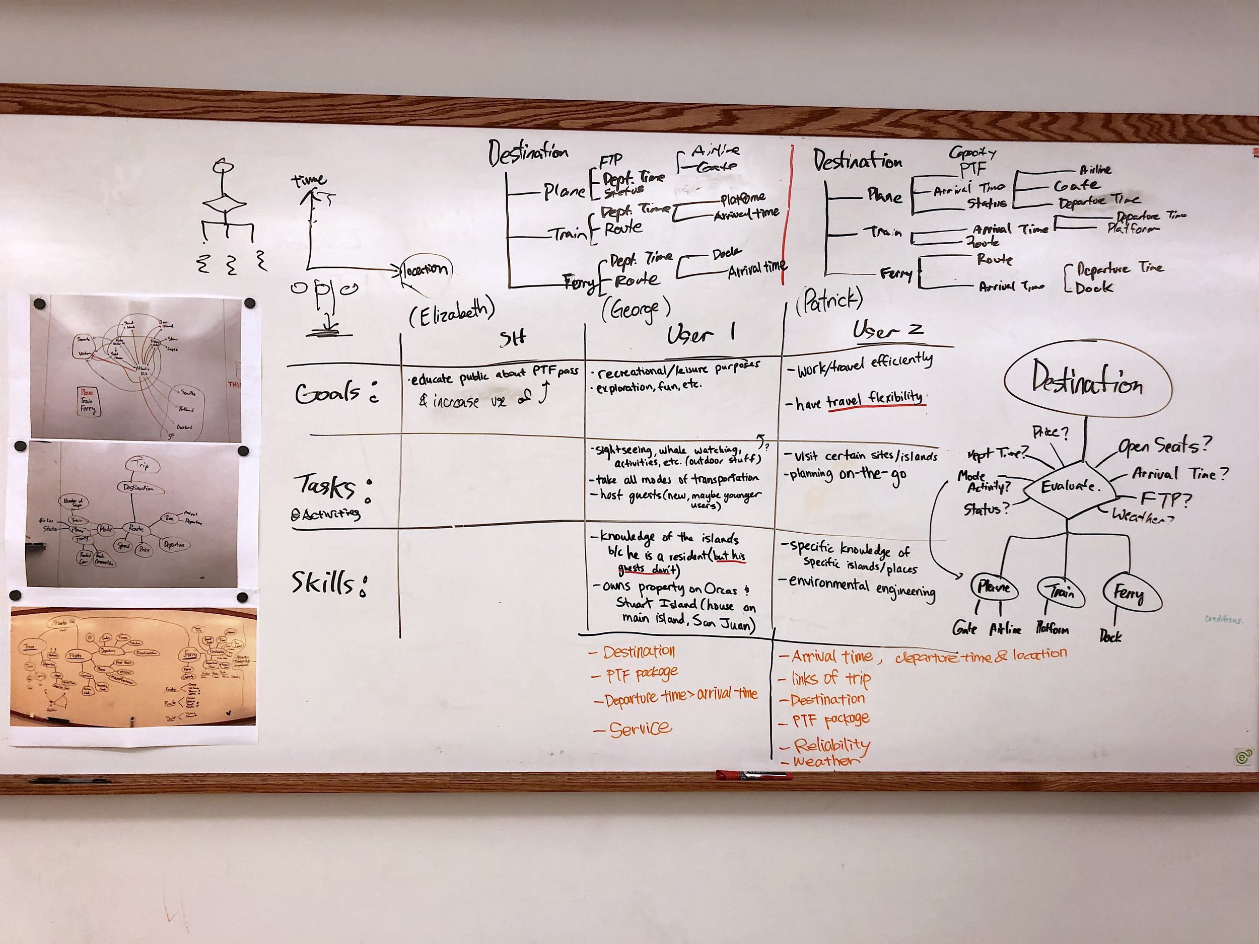
(Center) A chart outlining each user’s goals, tasks, and goals. (Right) A diagram with destination as our focus and the types of information that a traveler might evaluate that are related to their goal to reach their destination.
We began by creating a chart that delineated the goals, tasks, and skills for each of our user personas. We determined that as a business stakeholder and not an end user, Elizabeth’s needs were focused on her goal of promoting the PTF Pass while both George and Patrick, as end-users of our transportation data display, were connected by a shared goal of getting somewhere on the islands with different tasks in mind and under slightly different circumstances.
From these individual user persona mappings, we discerned that the destination was the most important bit of information for both George and Patrick so we made that a central part of our user mapping.
This phase demonstrated the purpose of data in design but also that, as designers, we need to notice patterns and extract only the essential information that a user or stakeholder would actually find beneficial.
Playing around with the dataset earlier helped us decide what information was related, necessary, and extraneous to our users.
Iteration 1: HAnd-drawn sketches
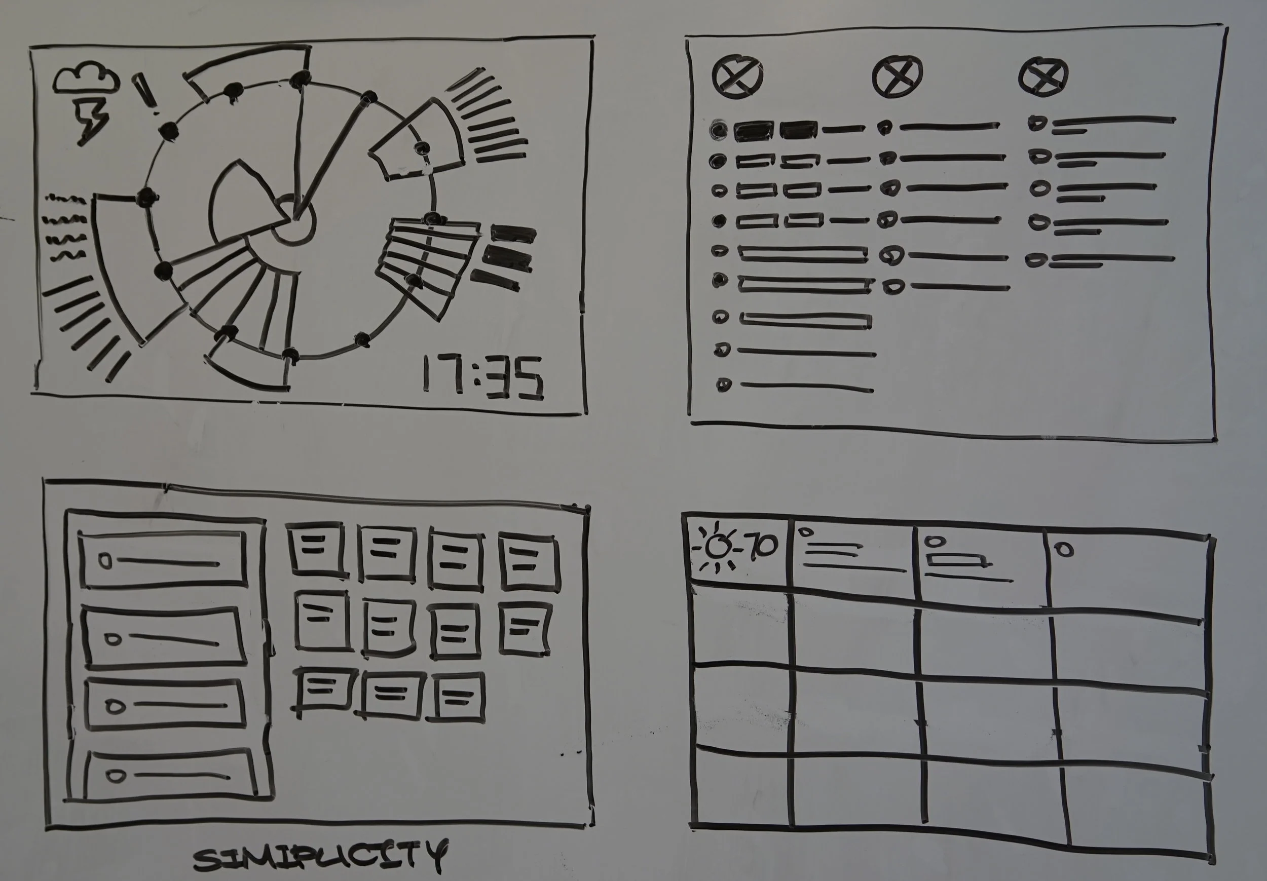
This was a time for rapid idea generation; we sketched and created many sketches of possible display designs as well as various ways to represent the data for our stakeholder and two user personas. As a team, we devised a priority list as well as different scales to begin our rapid ideation (1st image). I created several sketches (2nd, 3rd, 4th image) experimenting with different elements typically seen on displays such as maps and weather forecasts. With another team member, we also envisioned new ways to display data (5th image) like in a pie chart or a clean, grid structure.
It was also at this stage that we realized it would be helpful for users to visualize train and ferry connections to understand the continuity of transportation on the San Juan Islands as some destinations could not be reached without connections (3rd, 4th image). Here, I learned that ideation can be difficult!
iteration 2: Data-Driven display in digital form
In Adobe Illustrator, we synthesized our ideation sketches into one design. We started with positioning our display on three different scales: relativity, interaction, and business. Through the process, we agreed on what role should our display play in the environment and how it could help the users.
This also involved us re-evaluating our constraints:
location of the display in the hub — a good 15 feet off the ground for better visibility
limited size (about 50 in. TV screen)
the importance and promotion of the PTF Pass for our business stakeholder, Elizabeth
One of the challenges in this stage was evaluating all of our individual hand-drawn sketches to create an agreed-upon, unified digital display. That’s why creating the three different scales was a useful tool for us to first agree on what qualities and “feel” we wanted our display to have.
After discussing our design further, we felt that there was too much cognitive load that our display was burdening users with. We thought of some justification for our new design decision:
Patrick (our businessman) when he’s in a hurry: if there’s so much going on, where are they going to look —> re-evaluate information architecture and hierarchy
Members of George’s family (inexperienced users): where can they find useful information without getting too confused? —> remove distractions
Elizabeth’s promotion of the PTF —> adding appeal to the PTF pass program —> displaying benefits/charm of the San Juan Islands
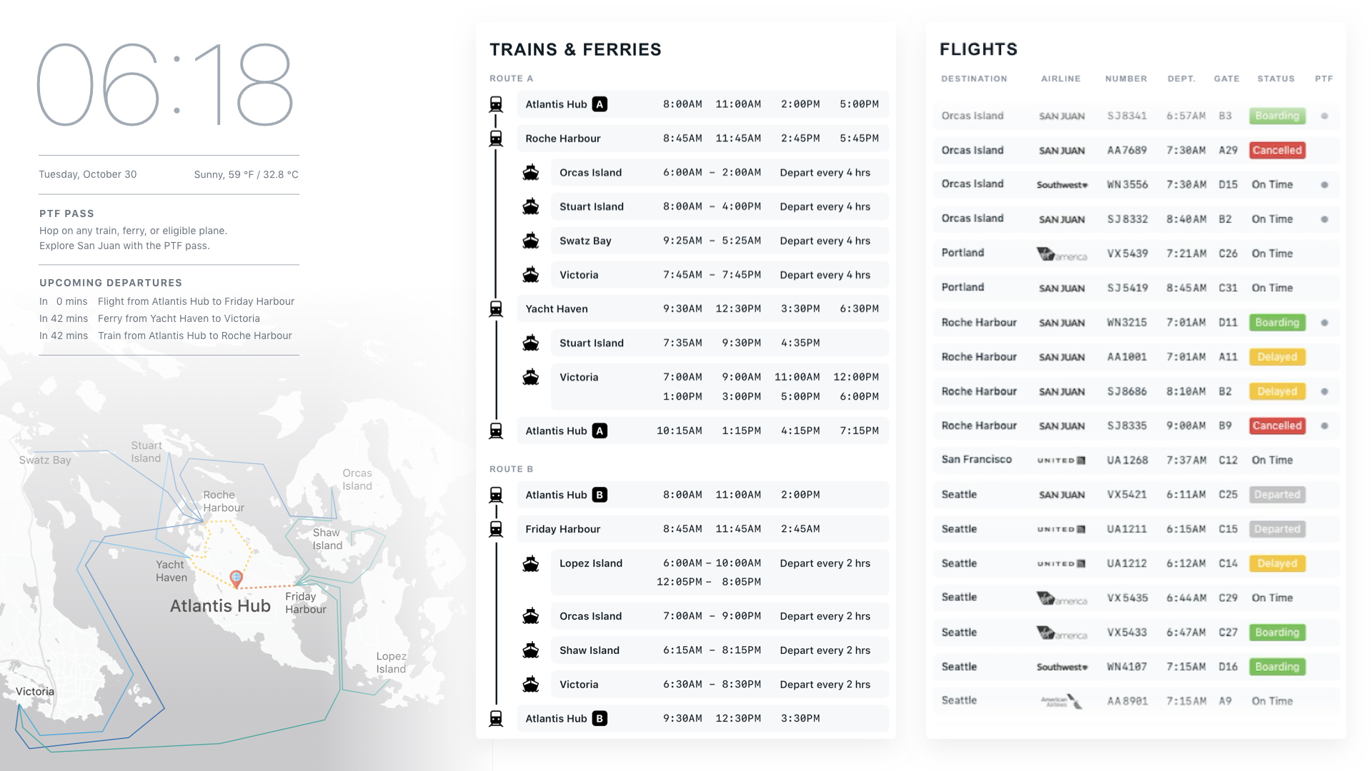
Side-by-side comparison:
A scrolling motion was later added to our final prototype using AfterEffects. The far right module ("Flights”) scrolls on the display as a way to show all the available flight information at any given time.
Adding a control
Notes and concept ideas from the rapid ideation session.
One requirement of this project was to include the use of a physical control. After another phase of ideation, we decided to incorporate a ship’s steering wheel as an interactive tool to control. We chose this control because we felt that our display lacked greater promotion of the PTF pass program that our stakeholder Elizabeth was concerned about.
By adding a wheel to the experience of the display, we could convey the idea that the user is control of their journey. It was also a thematic choice and one we felt would bring delight to our users.
Reflection
This was a really exciting project personally for me because it is one of the first group design projects I have ever done. It was amazing to work on a team with people with a much different background than me because it helped us think of new ideas and new perspectives. Sometimes it was challenging to balance all our own rationales for our decisions, but it was a rewarding experience that I learned a lot from.
Some things I learned are:
Self-criticism is the death of creation (during rapid ideation): a little dramatically-said but I think it’s important. Some ideas come from a wild imagination but if you don’t let those ideas run wild, you may never even know about them.
Be able to defend your design decisions (even when you’re always challenged): the key is to sincerely take criticism and feedback, but to stand your ground in decisions that were informed by your qualitative and quantitative research—balance it out!
Discuss, communicate, and recap: communication is key! If you and your team aren’t on the same page, small problems can become big ones—and you won’t feel like you’re on a team. It is critical to communicate with your colleagues about the expectations of the ideas, work method, and outcomes.
Have some fun: some ideas were just ideas, and that’s okay. The process can be laborious but it’s incredible to see what people can come up with! How we came up with the ship wheel as our control was a result of us having a little fun (:


